

SALLY-FIT BY THE SEA
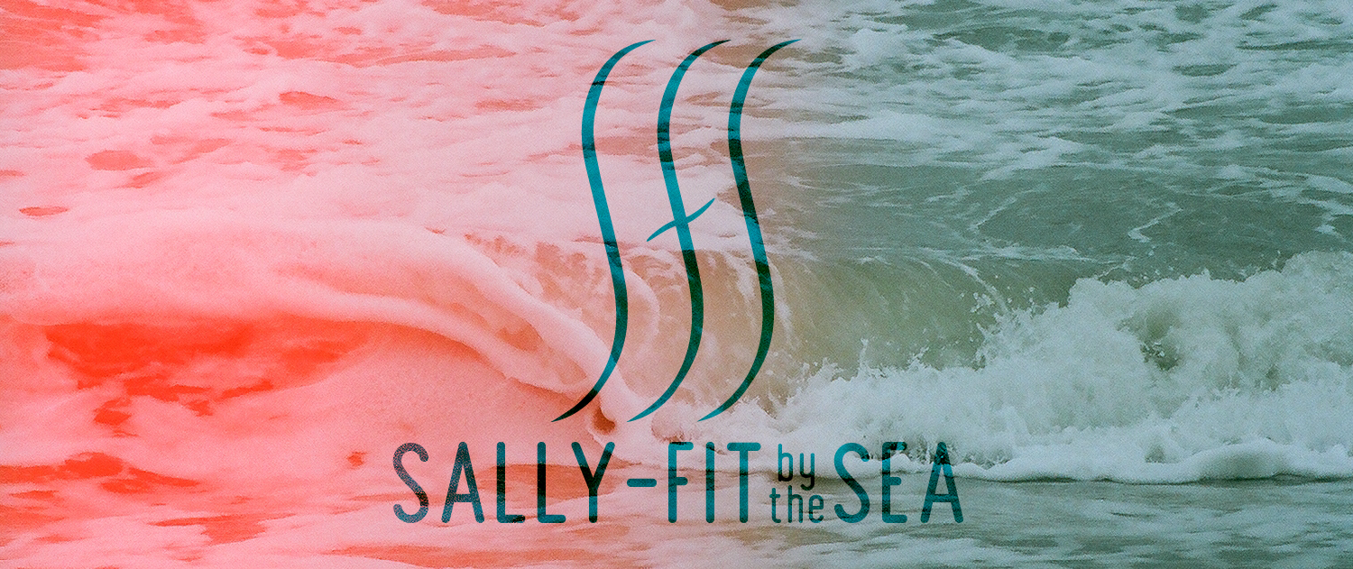
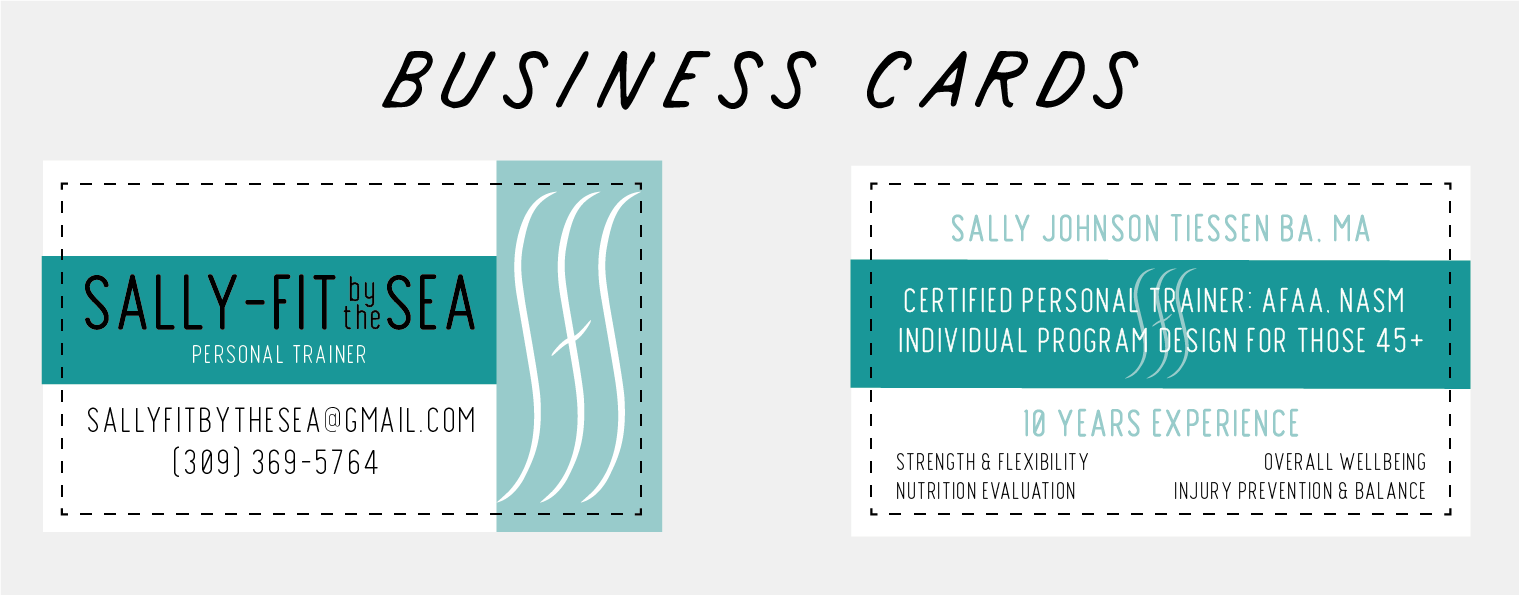
Sally-Fit By The Sea is a personal trainer based in Los Angeles, California who focuses on clientele of 45 year old and up. It was important for this branding to have a logo that was both energetic, but very tasteful. Being based in California, the brand also had strong ties to the ocean. With this in mind, I took the initials of the brand and made them into wave illustrations. The logo being simple offers a lot of variability in application, is easily identifiable, and subtle energy. To pair with the minimal logo, I went with a modern, bold, sans-serif font, that communicates the strength involved with personal training.
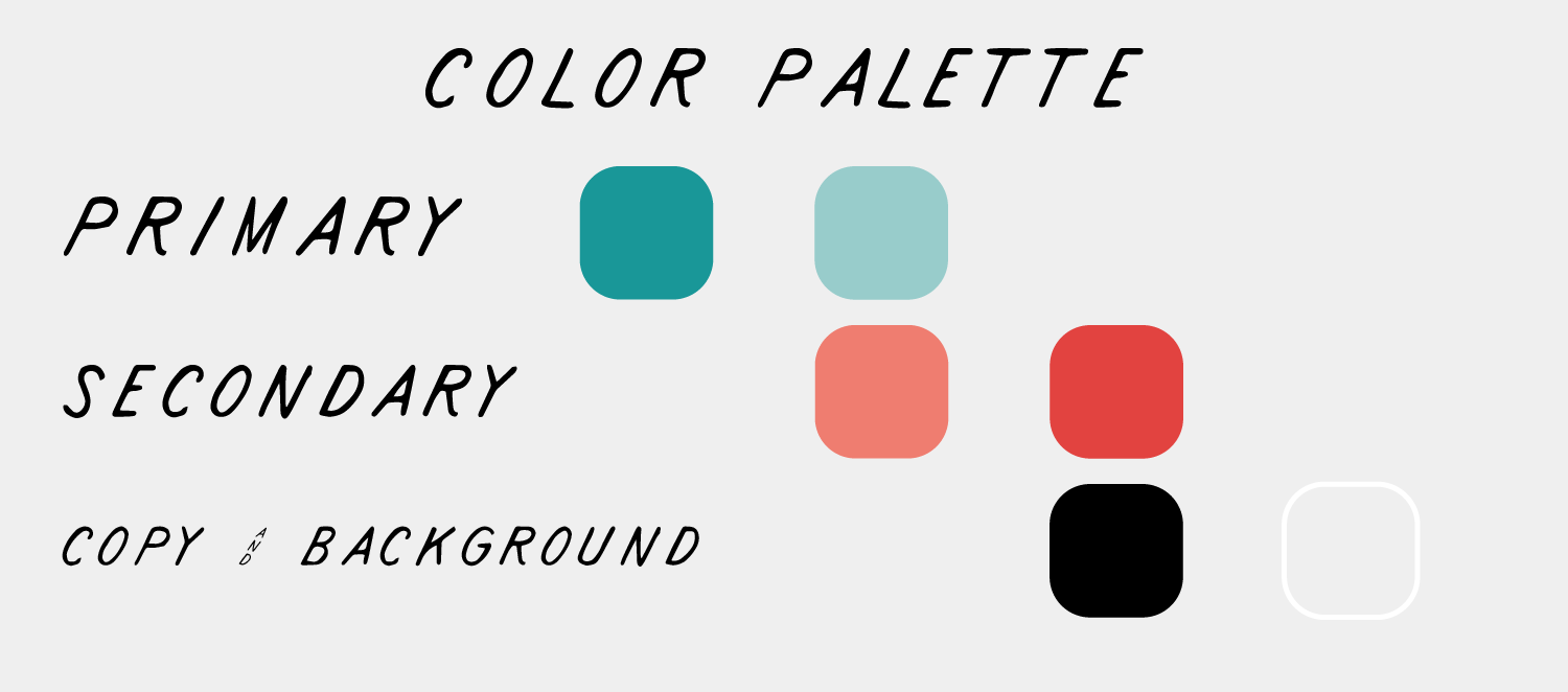
Green is a color that conveys energy, life, and growth in the natural world. We subconsciously associate it with plants, that, in essence, the epitome of resilience and adaptation, which is what Sally focuses on with her 45+ age group. For the specific tones of green I chose, I took heavy inspiration from the ocean, using what most would consider a shade of “seafoam” green. For secondary colors I chose a “choral” orange to add some vibrancy and help bring out feelings of enthusiasm and stimulation through the energy it holds.
For curated Instagram content I used ocean-themed photos from my personal work as backgrounds to motivational quotes and fitness tips. I utilized the ability to upload multiple photos on a single post to increase the likelihood of engagement and views of followers/non-followers


